Classic Updated Fresh labels for Freiherr Von Landenberg
Wine label design
A small regional vineyard asked me to modernise the packaging for thier next vintage. I worked closely with the company to perfect a new logo, a classic label and a label with a modern twist.
They wanted to keep the crest, but modernise the logo for a fresher look and to attract a new market. Due to the historical significance of the vineyard and area, they requested a design that stayed true to the heritage and was not so progressive that it alienated existing clientele.
www.weingut-von-landenberg.de
Final design 1
Modern
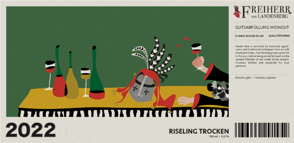
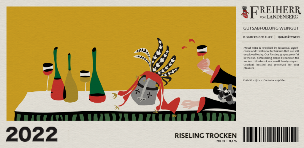
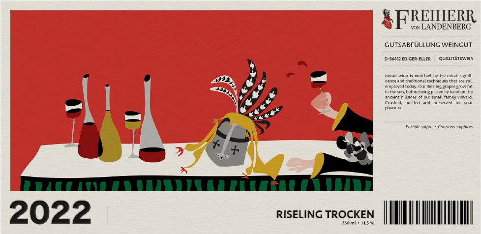
The final design chosen by the vineyard included an illustration evoking the ancient heritage of the valley in a modern interpretation. I used a classic colour palate, the yellow used on the property, the red from the crest of arms and a green to symbolise the famous hillsides on which the grapes are grown.
Final design 2
Classic
The final choice for the classic label was this abstract interpretation of the famous Mosel valley ridges, famed for being the steepest in the world. Using reference images I experimented with negative space and instinctual strokes to build an image that remained classic but without the dated dark colours and crest.


